Choosing the right paint colors for your home can feel overwhelming, but the right combinations can transform your space into a cohesive and inviting sanctuary. This year is all about bringing the outdoors in with paint colors. Expect to see rich earthy shades like Glidden’s “Purple Basil”, Dunn-Edwards’ “Caramelized”, and Benjamin Moore’s “Cinnamon Slate” popping up, alongside a cozy option like “Elderton”.. Whether you’re looking for timeless neutrals or daring statement shades, these expert-approved color combinations will help you create a stunning interior. Plus, we’ve included links to real paint swatches so you can shop more easily!
Key color trends for 2025:
Earthy Tones & Neutrals:
“Caramelized” by Dunn-Edwards is a warm, terracotta brown and has been described as the “ultimate new neutral.”
Graham & Brown’s “Elderton” is a really nice, neutral brown that makes you feel super calm and connected to nature.
Cinnamon Slate by Benjamin Moore is a really nice plum-brown color. It’s modern and stylish, and it makes a space feel both put-together and cozy.
“Mapped Blue” from Dutch Boy is a mid-tone blue that works in just about any room, and those slight yellow touches keep it from feeling too cool. It’s a color that’ll stay stylish for years to come.
Bold & Unique Colors:
Glidden’s “Purple Basil” is a friendly and inviting shade of deep violet.
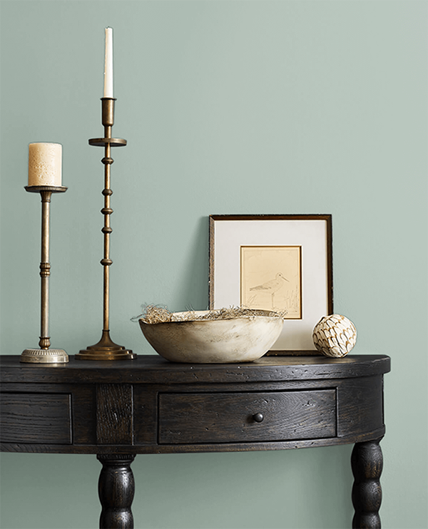
“Quietude” (HGTV Home by Sherwin-Williams): A cool green, a soothing sage green with blue undertones.
Top Interior Color Combinations for 2025
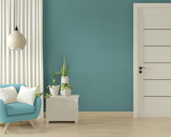
Caramelized + Quietude
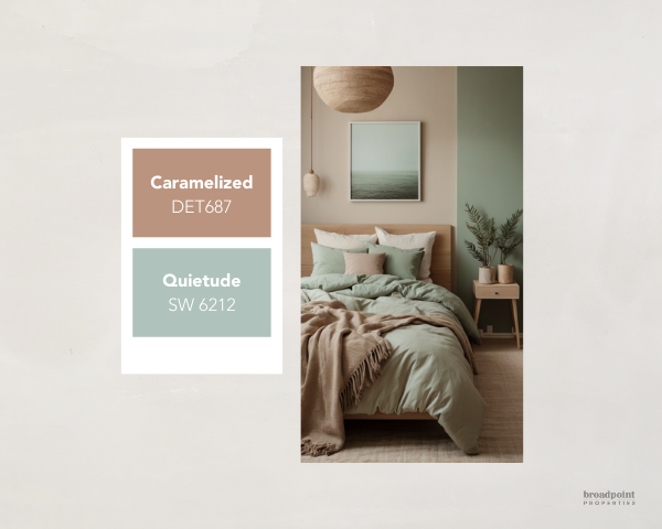
This color combination balances warmth and tranquility, creating a space that feels both inviting and serene.
- Caramelized (Dunn-Edwards) is a rich, golden caramel hue with warm undertones that bring a cozy and welcoming feel. It works beautifully in spaces where you want to create a sense of warmth and comfort.
- Quietude (Sherwin-Williams) is a soft, muted blue-green with a hint of gray, evoking a calming and spa-like atmosphere. It adds an airy, refreshing contrast to the warmth of Caramelized.
How to Style This Palette:
- Best for: Living rooms, bedrooms, kitchens, or even a cozy reading nook.
- Wall Pairing: Use Caramelized for an accent wall or cabinetry and Quietude for the main walls to keep things fresh and airy.
- Textures & Patterns: Layer in woven textiles, ceramic vases, and botanical prints to enhance the natural feel of this color duo.
- Furniture & Decor:
- Pair with warm wood tones (oak, walnut, or rattan) to complement the golden hues.
- Add neutral linens (beige, ivory, or soft gray) for a balanced and cozy feel.
- Incorporate brass or matte black accents for a touch of sophistication.
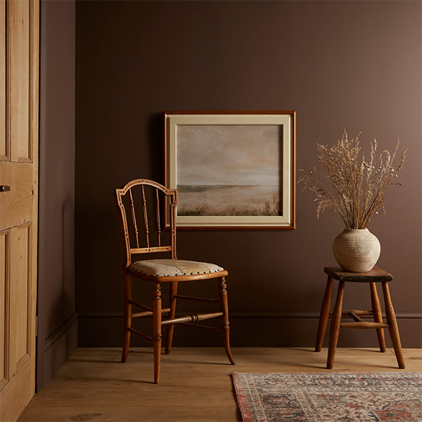
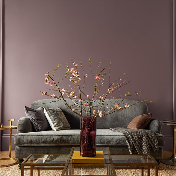
Elderton + Broadway
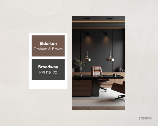
This pairing is a bold and sophisticated mix of warmth and drama, perfect for creating a rich, inviting space with a modern edge.
- Elderton (Graham & Brown) is a deep, earthy red with warm undertones, evoking a sense of coziness and timeless elegance. It has a refined, almost heritage-like feel, making it a great choice for adding warmth to a space.
- Broadway (Behr) is a rich, velvety black with a subtle softness, giving it a bold yet welcoming presence. This deep, dark hue grounds the palette and adds a sense of luxury and depth.
How to Style This Palette:
- Best for: Dining rooms, home offices, bedrooms, or any space where you want a touch of drama and sophistication.
- Wall Pairing: Use Elderton as a feature wall for warmth and Broadway on trim, doors, or cabinetry for contrast and elegance.
- Textures & Patterns: Velvet cushions, herringbone or geometric patterns, and antique gold or matte black fixtures enhance the luxe vibe of this color combo.
- Furniture & Decor:
- Incorporate dark-stained wood furniture or brass accents for a vintage-inspired look.
- Pair with cream, beige, or soft taupe textiles to balance the richness of the colors.
- Add touches of deep green or navy blue in accessories for a layered, moody aesthetic.
Cinnamon Slate + Glacier White
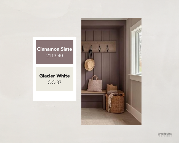
This pairing strikes a beautiful balance between warmth and crispness, making it a perfect choice for a cozy yet modern aesthetic.
- Cinnamon Slate (Benjamin Moore) is a rich, earthy brown with warm red undertones, giving a space depth and a grounded feel. It evokes a sense of warmth and sophistication, making it ideal for an inviting atmosphere.
- Glacier White (Benjamin Moore) is a soft, cool white with a hint of gray, offering a clean, refreshing contrast to Cinnamon Slate’s warmth. It enhances brightness and keeps the space feeling airy and balanced.
How to Style This Palette:
- Best for: Living rooms, bedrooms, kitchens, or home offices where you want a mix of coziness and elegance.
- Wall Pairing: Use Cinnamon Slate on a feature wall for warmth, with Glacier White on surrounding walls, ceilings, and trim for a crisp contrast.
- Textures & Patterns: Use linen, woven textiles, or subtle geometric patterns to bring depth to the space without overwhelming it.
- Furniture & Decor:
- Pair with natural wood tones (walnut or oak) for an organic, grounded feel.
- Add soft neutrals like beige or taupe in textiles to maintain a warm and cohesive look.
- Incorporate brushed brass or matte black fixtures to enhance sophistication.
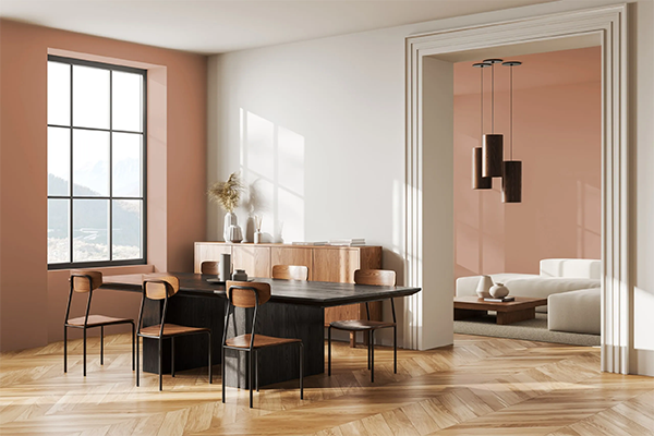
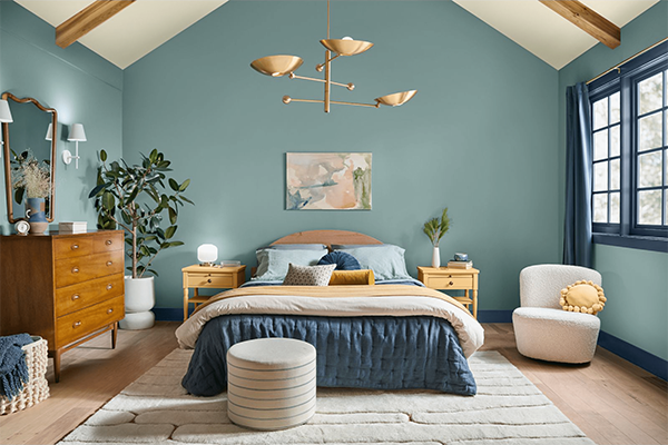
Mapped Blue + Chowning’s Tan
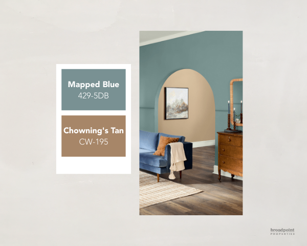
This pairing blends the cool, serene energy of blue with the warm, grounding presence of tan, creating a balanced and inviting space.
- Mapped Blue (Dutch Boy) is a deep, moody blue with gray undertones, offering a sophisticated and calming feel. It works beautifully as an accent color, adding depth without overpowering the space.
- Chowning’s Tan (Benjamin Moore) is a warm, earthy tan with golden undertones, bringing a cozy, natural vibe that complements the richness of Mapped Blue.
How to Style This Palette:
- Best for: Bedrooms, living rooms, home offices, or dining areas where you want a mix of warmth and depth.
- Wall Pairing: Use Mapped Blue as an accent wall or for cabinetry to add a bold touch. Paint the remaining walls in Chowning’s Tan to create a warm, neutral backdrop.
- Textures & Patterns: Layer with woven rugs, leather furniture, and natural linen curtains to enhance the cozy, organic feel.
- Furniture & Decor:
- Pair with rich wood tones like walnut or mahogany for a classic, timeless look.
- Add brass or aged bronze accents in light fixtures or hardware for a sophisticated touch.
- Use soft neutrals (cream, beige, or warm gray) in upholstery and textiles to balance the boldness of Mapped Blue.
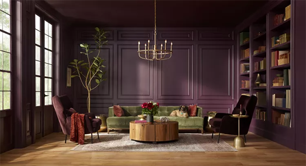
Purple Basil + Chantilly Lace
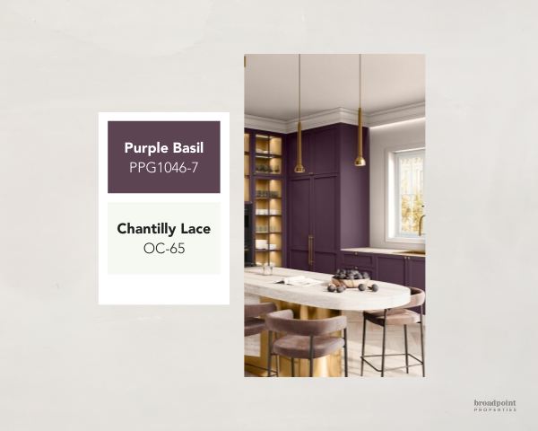
This pairing strikes a perfect balance between rich drama and crisp elegance.
- Purple Basil (Glidden) is a deep, muted eggplant with earthy undertones, creating a moody, sophisticated, and cozy atmosphere.
- Chantilly Lace (Benjamin Moore) is a clean, bright white with subtle warmth, adding contrast and an airy feel to keep the space from feeling too heavy.
How to Style This Palette:
- Best for: Bedrooms, dining rooms, living rooms, or entryways where you want a balance of boldness and refinement.
- Wall Pairing: Use Purple Basil on an accent wall, cabinetry, or wainscoting for depth and richness. Paint the remaining walls in Chantilly Lace to keep the space light and open.
- Textures & Patterns: Incorporate floral prints, geometric patterns, or woven textiles to add dimension and visual interest.
- Furniture & Decor:
- Pair with gold or brass accents (lighting, mirrors, hardware) for a luxurious touch.
- Introduce velvet or linen upholstery in deep greens, soft grays, or warm neutrals to complement the richness of Purple Basil.
- Use wood tones like walnut or espresso for furniture to enhance the cozy feel.
Tips for Choosing Paint Colors
- Test Before You Commit: Always buy sample swatches and test them on your walls in different lighting conditions before making a final decision.
- Consider Room Functionality: Use calming tones like blues and greens in bedrooms and energizing hues like yellows or reds in social spaces.
- Layer Your Palette: Combine base colors with accent walls, trim colors, or even ceiling shades for added depth.
- Don’t Forget Finishes: Matte finishes work well for walls, while semi-gloss is ideal for trims and doors. More tips on choosing the right paint finish here.
Whether you gravitate towards warm neutrals, bold jewel tones, or vibrant hues, there’s no shortage of inspiration this year. Use these expert-approved combinations to refresh your home with confidence—and don’t forget to grab those swatches to see how they’ll look in your space!
Ready to start painting? Shop these trending colors today and transform your home into the sanctuary you’ve always dreamed of!