
It is fair to say that color is part science and part art. Color is a form of non-verbal communication that can affect our mood and emotions, that’s why it’s crucial to create a color scheme for your space. The more you know about how color works, the easier it will be to work with when you’re decorating your humble abode.
Luckily, choosing colors for your home doesn’t need to be all guesswork. You’re probably familiar with the color wheel, and this simple tool is where you can start finding inspiration.

Half of the color wheel is composed of warm colors – from red-violet through the reds, oranges, and yellows. The remaining half is the cool colors – the yellow-greens through the violets.
Colors that sit opposite each other are called complementary colors or simply complements. Choosing warm-cool schemes can be a bit tricky, but there are ways to tweak your choices and come up with appealing combinations.
How to Combine Warm and Cool Colors According to Experts
- Avoid using complementary colors at full saturation. Let’s go back to the color chart. Say you’re a fan of green but you’re not very fond of it with red. Consider shades other than true red and green like a lighter green, particularly a dusty shade like sage. Sage looks great with red. Instead of true green and true red in equal strengths, try a lighter green or red.
- Another strategy is to pick various shades surrounding your key colors. Rotate positions on the wheel in one direction or the other from two key colors. For example, instead of blue and orange, try blue-green and red-orange or blue-violet and yellow-orange.
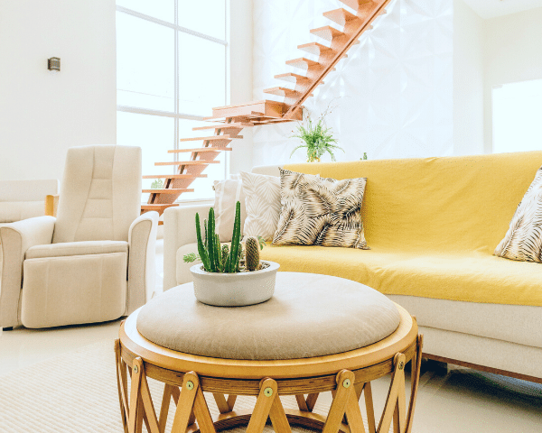
Image from Studio McGee
- An alternative would be to do a split-complement scheme, meaning choosing three colors, instead of just two. It can be your key color plus the two colors that sit on either side of its complement. Let’s use purple as an example. Instead of pairing it with its complement, yellow, you use its two neighboring colors, yellow-orange and yellow-green. Or vice-versa, mix yellow to red-violet and blue-violet.
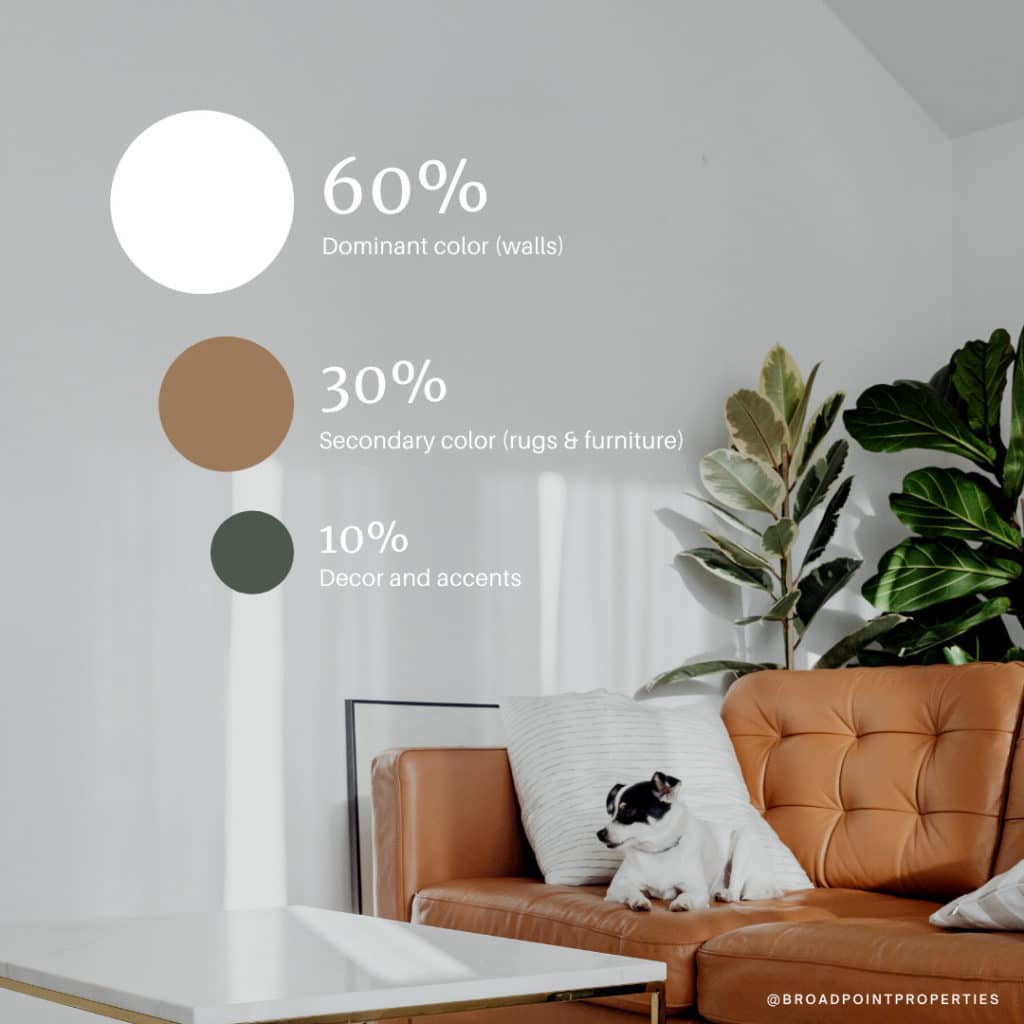
- Complements work best when used in small doses. Choose a main color then use the secondary color as an accent. Or better yet, follow the 60-30-10 rule – where 60% is your dominant color, 30% is a secondary color and 10% are accent colors.

Above anything else, as any good pro designer will tell you, the color in your home should be a reflection of you and make you feel happy and comfortable. Feel free to browse our blog for more design and real estate tips.